 |
相關閱讀 |
供独立游戏开发者参考的2D美工教程(二)
 |
>>> 技術話題—商業文明的嶄新時代 >>> | 簡體 傳統 |
经过第一部分教程的练习,我们已经掌握了圆形和方形工具,还了解了填充和组合对象的方法。现在我们可以进一步学习制作基本的场景了。
渐变
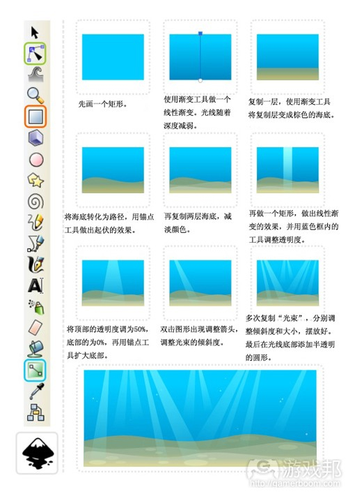
我们再进一步运用渐变填充工具,制作一个简单的水下背景。
小贴士:
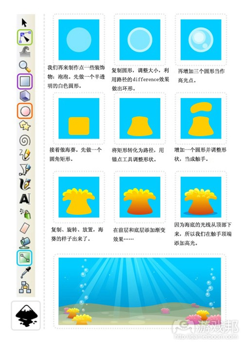
用“Page Up”和“Page Down”键来调整对象的顺序(如把中间的海葵层移到光线层后面)。
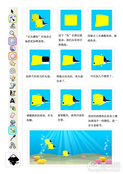
我想给这个海底世界增加一点生机,所以我要制作一些鱼。在矢量场景中增加“真实的”元素,其基本原理是观察形状,然后把图形“分解”成圆形、矩形、方形或椭圆形等基本元素。
我通常是从谷歌搜索一些参考图片,以进一步完善我的想法。我搜到了一些黄色的“长头蝶鱼”的图片。
我的“分解”法很有效:鱼的主体接近方形,前部略呈三角形。
这个“分解”图形的方法也适用于其他更复杂的图形,基本原理就是找出“组成的积木”。
clip工具
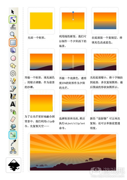
逛完了海底世界,我们还要到岸边的沙滩上看看日落。接下来我们再学习一些更实用的工具和技术。
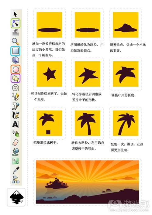
这就是我们的“摇滚式”日落,我们要做的就是把圆形变成水中的石头,再进行渐变透明填充处理。
用矢量制作图形的另一个优势在于它的可延展性——对象可以无损质量地收缩或放大,便利了图片的编辑和调整。
如图,棕榈树的大小决定了观察者的观看距离。较小的棕榈树使小岛看起来更小,更加遥远,而大的棕榈树则让小岛看起来更大。更加接近。
顺便一提,云的形状是一样的,因为小岛只是压缩了,并配合天空的渐变调整了颜色。请尝试一下重复利用图形,甚至只需要微调整、重上色、压缩、旋转或增加变量,你的场景就会更加生动有趣。
注:
我在教程中用到的图形(棕榈树等)是来自预先定义好的图形(游戏邦注:如圆形、方形、星形等),这只是一种选择。徒手或直线工具也可以达到相同的效果,但需要一定的美术技巧。
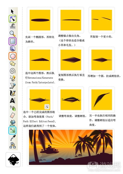
为了丰富棕榈树的细节,我们需要运用到inkscape的两个“更高级”的功能:插值(Interpolation)和路径效果(Path Effects)。
改变叶片,增加插值以及参考一些图片可以进一步改善棕榈的外观。
我希望这些稍微高级一点的功能不会给大家带来太多麻烦。
教程图18(from gamasutra)
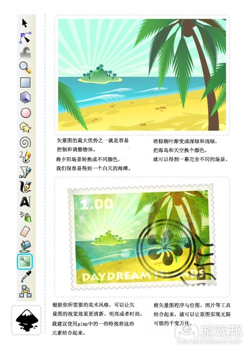
如果你想制作如上图所示的邮票齿状边缘效果,可以按照下面的步骤进行操作:
注:先进行取消组合并集合圆的原因在于,Inkscape仅限两个对象之间进行Union、Difference、Intersection、Exclusion或Division的操作。
而CoreIDraw之类的工具却可以进行成组或者几个选中对象之间的同时操作,不妨挖掘下你的矢量应用程序还有哪些更顺手的操作指令吧。(本文为游戏邦/gamerboom.com编译,拒绝任何不保留版权的转载,如需转载请联系:游戏邦)
2D Game Art For Programmers – Part 2
by Chris Hildenbrand
After the initial playing around with circles and squares, learning a little bit about the fills and combining objects [part 1] , I would like to move on to a basic scene.
Having more fun with gradients:
Let’s take the gradient fill to the next level and work with colour and alpha to create a simple underwater background.
Hint:
Use the ‘Page Up’ and ‘Page Down’ key to adjust the order of objects [e.g. place the sea anemones in the mid ground behind the light rays.]
I would like to add more life to the underwater scene and create some fish. The basic principle when adding ‘real’ elements to a vector scene is to look at the shapes and ‘deconstruct’ them into basic elements like the circle, square, rectangle or ellipse.
I usually do a quick google image search for a reference image to get a better idea what I am going to create. In this case the ‘yellow reef fish’ search came up with a nice yellow longnose butterfly fish.
It works great as the main body is kind of squarish and the front has a triangular shape.
The same approach works the same with far more complex elements. It’s a matter of seeing the ‘building blocks’.
Staying in shape… the Clip Tool…
In line with the water theme let’s go ashore and look at a sunset on the beach to introduce some more helpful tools and techniques.
This is our basic ‘pop style’ sunset with some modified circles and gradient alpha fills added to represent some rocks in the water.
One of the ‘wonderful’ things about working with vectors ist the scalability. Objects can be scaled up and down without loss, allowing for easy editing and adjusting of the illustration.
In this case the scale of the palm trees will define the viewer’s perception of distance. Smaller palm trees will put the island further in to the distance while large trees will ‘bring’ it up close.
Btw. the clouds are the same shape as the island just squashed and coloured in a colour matching the sky gradient. Try reusing shapes even just slightly modified, recoloured, squashed, rotated or flipped to speed things up, add variation and make your scene more interesting.
Note:
A lot of the objects I am covering in my tutorials (like the palm trees above) working from predefined shapes (circle, square, star, etc.) is only one option. The freehand or straight line tool will create identical shapes but require a little more artistic skill.
For our detailed palm we need two ‘more advanced’ features of inkscape: Interpolation and Path Effects.
Varying the fronds, adding to the interpolation and checking some reference images can improve the look of the palms even further.
I hope even these slightly more advanced features don’t pose too much of a problem. Enjoy and stay tuned for more!(source:gamasutra)
Chris Hildenbrand 2011-10-27 06:22:17
評論集
暫無評論。
稱謂:
内容:
返回列表
